

Typografie
Heading
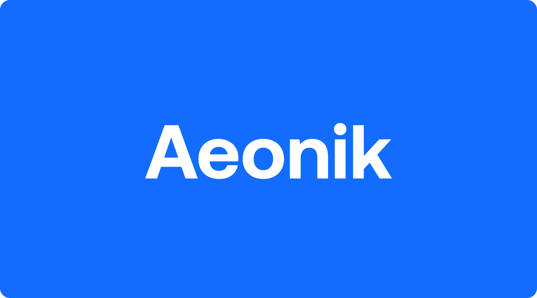
Aeonik
For titles, we use Aeonik Bold across consumer-facing marketing materials, our website, and social media. Aeonik Bold is only used by the marketing team.
Body
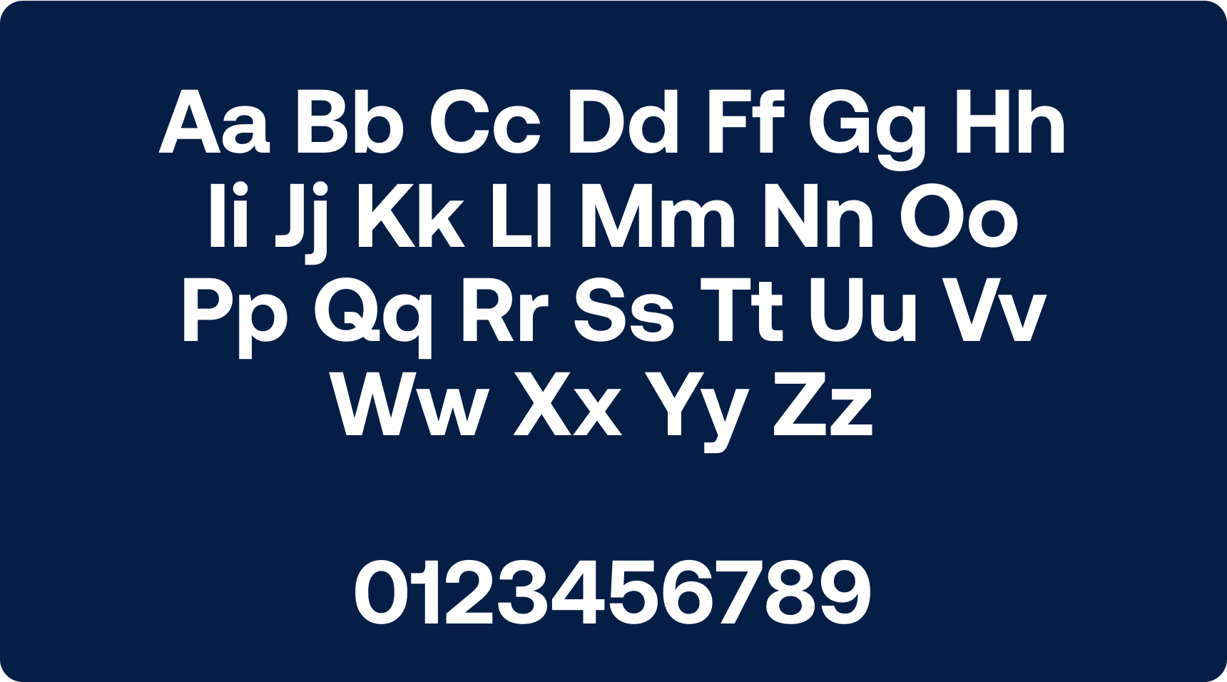
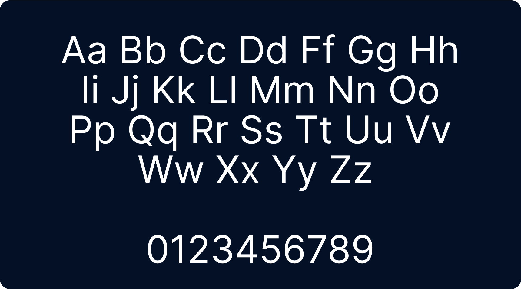
Inter
We utilize this font for longer body text and smaller applied type. Inter is usable by the entire organization.

Hierarchy
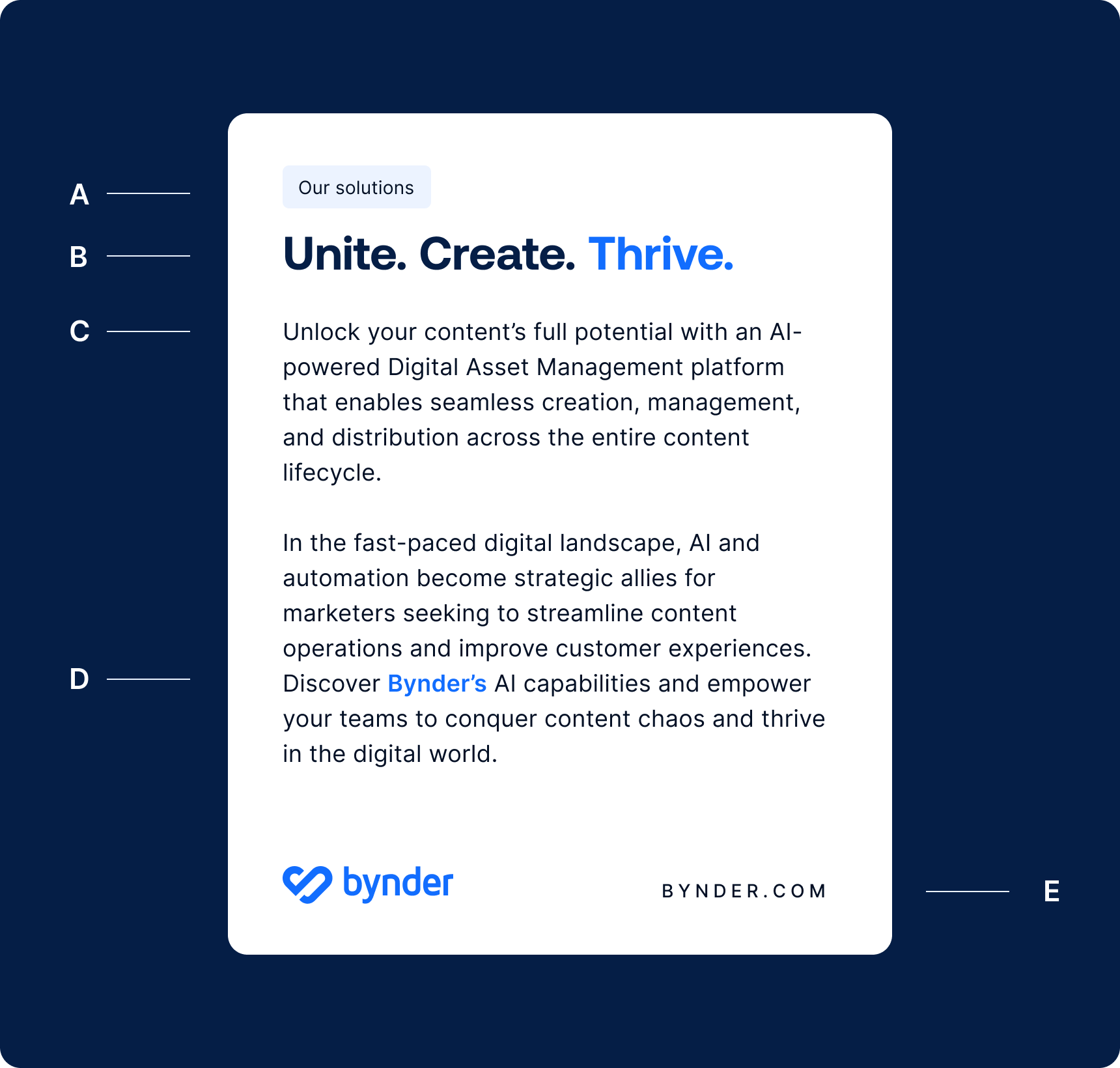
When employing typography, kindly follow the provided structure as a reference.
When it is not possible due to technical limitations to use the Aeonik Bold font for titles, replace with Inter Bold.
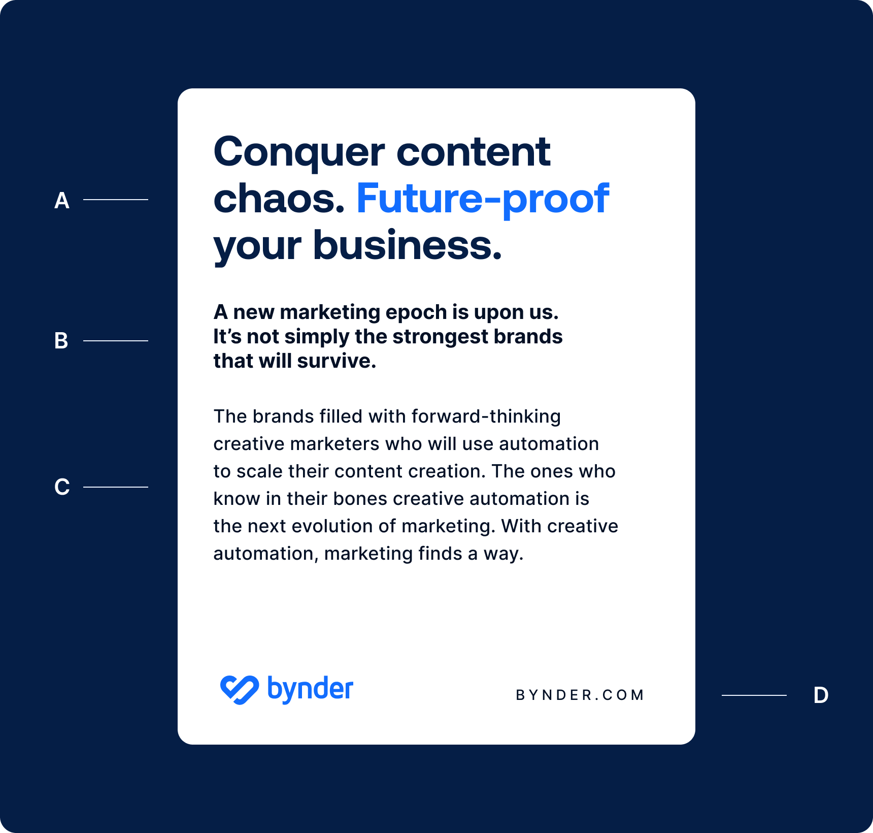
A — Sub-title
Inter Regular (boxed)
B — Title
Aeonik Bold
C — Body
Inter Regular
D — Strong
Inter Semi-bold
E — Caption
Inter Medium (capitalized)
Spacing
Follow the guidelines below on leading and letter spacing to ensure the layouts look consistent, bold and readable.
A — Title
For compact and powerful looking titles suggested leading is 110% to the font size. For example, for font size 42pt a leading of 46,2pt is used. It is possible to deviate 10% from this recommendation.
B — Runner
For best readability experience suggested leading is 120% to the font size. For example, for font size 20pt a leading of 24pt is used. It is possible to deviate 20% from this recommendation.
C — Body
For best readability experience we recommend leading of 150% to the font size. For example, for font size 18pt a leading of 27pt is used.
D — Caption
To make captions easy to read we add letter spacing of 25% and use capitalization.
Highlight
We can use either a lighter color or a box around text to emphasize the words we want to highlight.


Contrast
Please ensure the titles are legible and have the appropriate contrast by checking the colors of the data stream behind the text.